A user interface, or UI, is the set of screens, pages, forms, buttons, and any other visual elements through which end users interact with a piece of software.
The concept of UI is closely related to the idea of UX, or user experience, which refers to the overall feeling, (or experience,) people have when they interact with software. A robust and intuitive user interface will result in a satisfying and enjoyable UX.
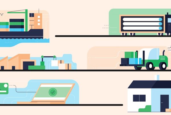
As a business, it’s critical that the software you use internally, (for example, supply chain software or accounting software), has a robust UI and UX since it will enable your employees to complete their work quickly and efficiently, boosting company productivity and growth. On the other hand, a poor user interface, and user experience will cause confusion among employees, as they struggle to navigate their way through internal software to complete essential tasks.
/ux-design-process.jpg)
What an effective UI enables users to achieve
According to the behavioral psychologist Dr. Susan Weinschenk, who advises many Fortune 1000 companies including tech firms, on how to improve their business results from a brain and behavioral science perspective, an effective UI results in users being able to:
- Get a task done with a minimum amount of effort and reducing the opportunity for error.
- Learn how to use the interface, or software quickly, without the need for extensive training or assistance.
- Remember how to use the software, or interface the next time they log onto it.
- Prefer the software, or interface over an alternative way of getting the work done (i.e., using spreadsheets or manual processes).
How can you judge whether the user interface of your internal software accomplishes the points listed above? Here are four crucial components that all great user interfaces have, and that you should look out for:
Component One: The user interface is as intuitive as possible
Navigation of the UI is simple, and straightforward, ensuring that users can switch between screens and pages in a logical process, enabling them to get the information they need as quickly as possible without having to browse through countless menus.
At Gravity Supply Chain, we make sure the users of our software can effortlessly navigate through our UI by clearly signposting how they can reach specific information (e.g., by using meaningful icons). The method of signposting to guide people to the data they need often gets referred to as “providing an information scent.”
/design-elements.png)
Component Two: The design is simple
Fancy layouts, which contain a plethora of data points for users, can overwhelm your employees by offering too much information, making it difficult for them to complete their tasks. A simple user interface minimizes the risk of your users getting lost or confused.
Component Three: The design is consistent
Common elements, colors, words, visuals, and functions get consistently used across the UI; ensuring the user experience across the user interface is seamless. A lack of consistency will only create a chaotic and disorderly UX.
/design-elements-2.png)
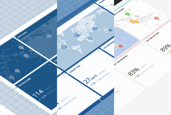
Learn how today’s supply chain software is focusing more heavily on UX
Component Four: Best practices get followed
At Gravity Supply Chain Solutions, our UI and UX lead, Julien Heron, makes sure to always keep up to date with the latest user interface, and user experience best practices. Doing so involves him attending conferences on UI and UX, as well as following UI and UX research groups which conduct wide-scale research on usability best practices, such as the Nielsen Norman Group, which is a particularly excellent resource.
For example, one best practice is to employ data visualization whenever possible, to make the data displayed to users easy to digest and process. A further “best practice” is the data-driven analysis of user behavior (e.g., examining areas where users may be struggling), or asking users directly for feedback, both of which can be used to implement improvements to the UI and UX.
Investigate industry best practices, and see if the UI and UX of your internal software adhere to them, thereby creating the most positive impact on your employees.
Increase productivity with a great UI and UX
At Gravity Supply Chain Solutions, we offer supply chain software that enables retailers, manufacturers, and logistics providers to obtain a real time view of their global supply chain networks, allowing them to make data-driven decisions that enhance the efficiency of their supply chains.
An effective UI and UX is at the heart of our software, and we incorporate the four elements above. By doing so, our customers can use our software easily, productively, and in an intuitive way that requires little training, thereby enabling them to improve the management of their supply chains as painlessly as possible, to strengthen their business.
/uiux-tiles.jpg)
Is the UI and UX of your internal systems making it easier for your employees to achieve their tasks in the most productive manner possible?